Rose Pak
- UI/UX
- Visual product design
- Responsive web design
Background
The College Board, known for running programs like the SAT and AP courses, helps millions of students navigate the transition from high school to college. The scholarship search tool allows students to import their data from an existing College Board profile or the Common App, or to start fresh. They can then use that data to find scholarships and in some cases easily apply to external scholarships through an export. There are two main parts to the search tool — scholarship results, and a comprehensive profile that covers most of the information that many scholarships require.
What's powering search?
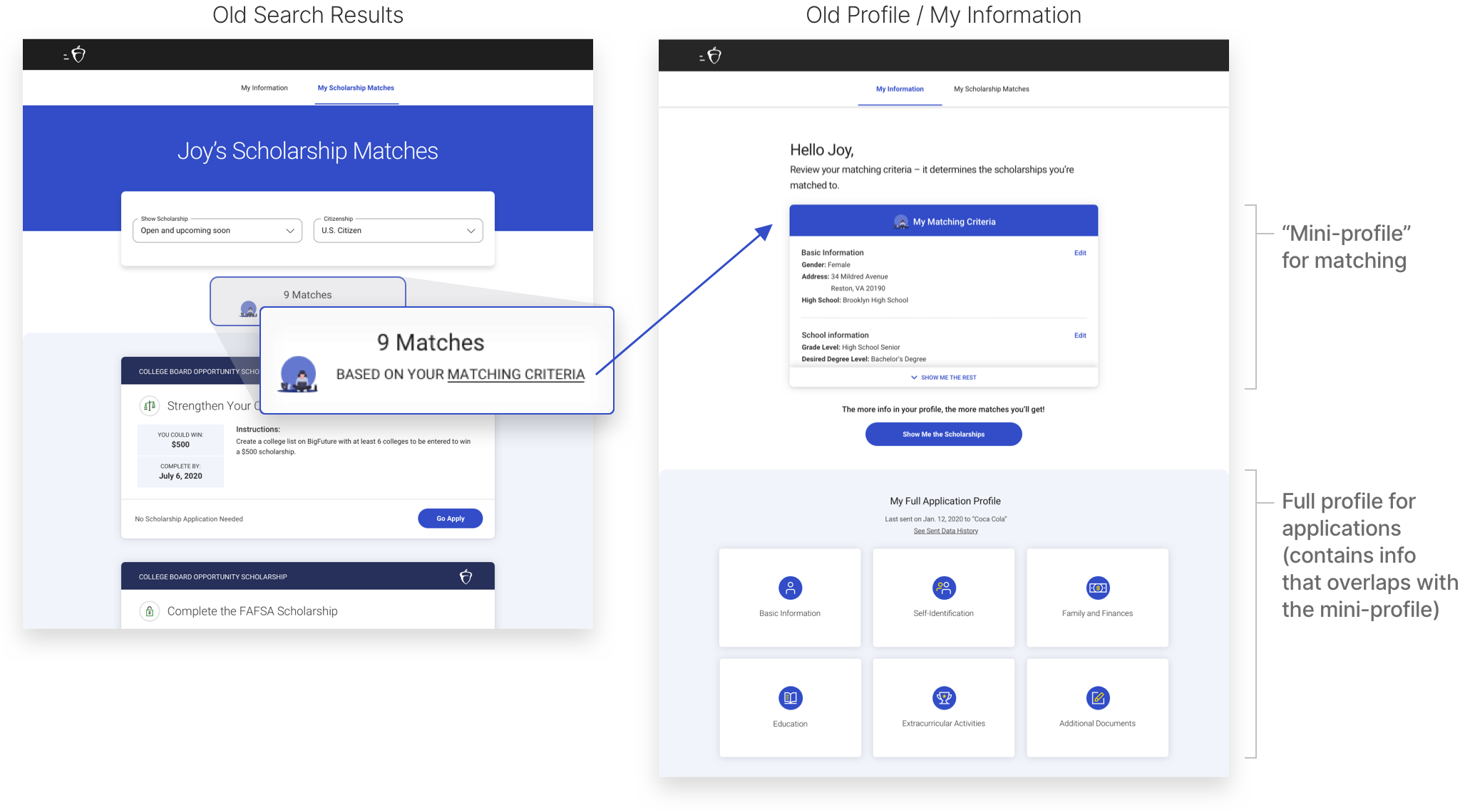
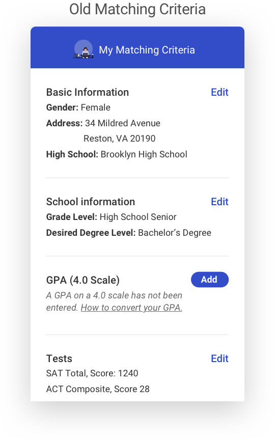
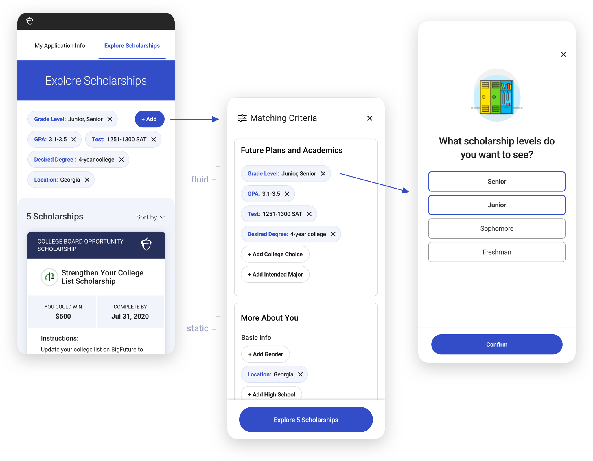
Only a small portion of the profile data actually matches the student to scholarships. In a previous version those were contained in a “mini-profile” (My Matching Criteria) that was on a separate page from the search results. To begin, students were prompted to enter or confirm 3 data points (grade level, degree sought, GPA) and were then taken to the scholarship results. In user interviews, we saw that students were not making the connection to their matching criteria unless prompted, so they didn’t know exactly what was powering their search. When students did find the “Matching Criteria” link, it often wasn’t clear whether they understood the difference between what was in the mini-profile vs the full application profile on the bottom, so some would just go in and fill out everything.
How to make search more exploratory?
Another problem we wanted to solve for was how to let students know they can do more exploration. For instance, juniors might want to be able to see and prepare for scholarships in their next year as well as their current, students might want to see what more could be available to them if they improved their GPAs and test scores, and they may want to see how their choice of majors or colleges would affect their options as well. Students were actually able to make those changes in the mini-profile, but the way it was kept on a separate page and behind edit buttons gave the feeling of permanence, and it could seem dishonest to change information about themselves. But, we actually wanted to encourage that kind of exploration.
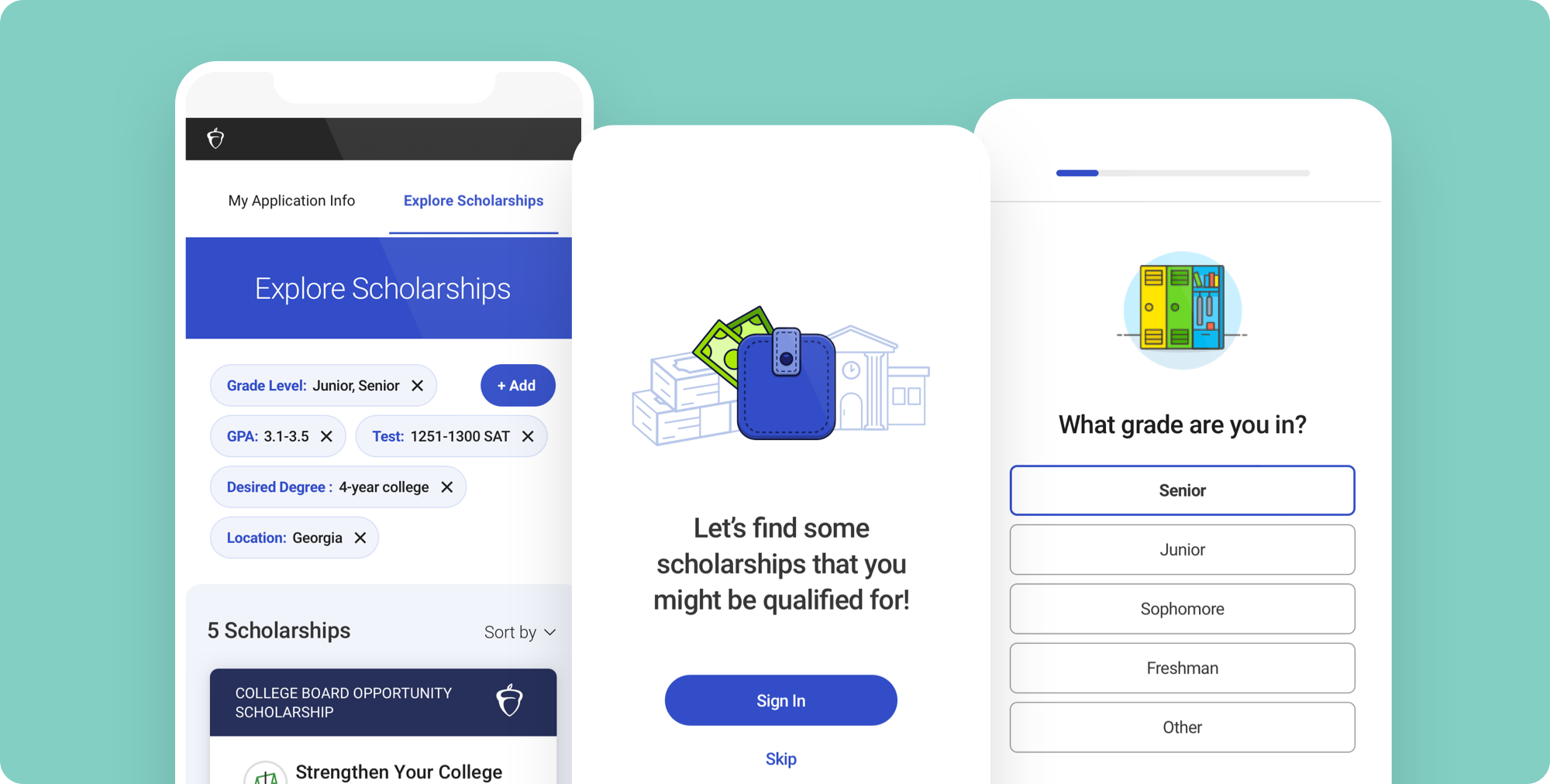
Using filter pills and onboarding
Our solution was to move the matching criteria directly into the search experience in the form of filter pills, so the student would know exactly what was affecting their search, and could easily change or add to them. The amount of visible filters are kept to 3 or 4 lines, and what we called the more “fluid” exploratory filters got first billing. Clicking the “Add” button takes them to all the matching criteria in an overlay, where they can quickly scan what has been selected and what other filters can be added. Here too the fluid filters are prioritized and separated out from the more static ones.
We designed a more robust onboarding experience which allowed us to give students a friendly, helpful, and encouraging entry experience. It accommodates unauthenticated students and underclassmen who are exploring and planning as well as authenticated seniors who have the most immediate need. The questions are a way to get enough information about new users to ensure reasonably targeted results to start while also allowing users with existing profiles to confirm their data. The onboarding screens provide both sets of users helpful contextual facts and guidance while letting them know that they can do more “exploratory” searches. We wanted to ask enough questions for meaningful search results, while being aware of question fatigue. We knew that users would be willing to go through a fair amount given the high value proposition of quality scholarships, but we also made sure to keep the tone engaging, encouraging, and purposeful.
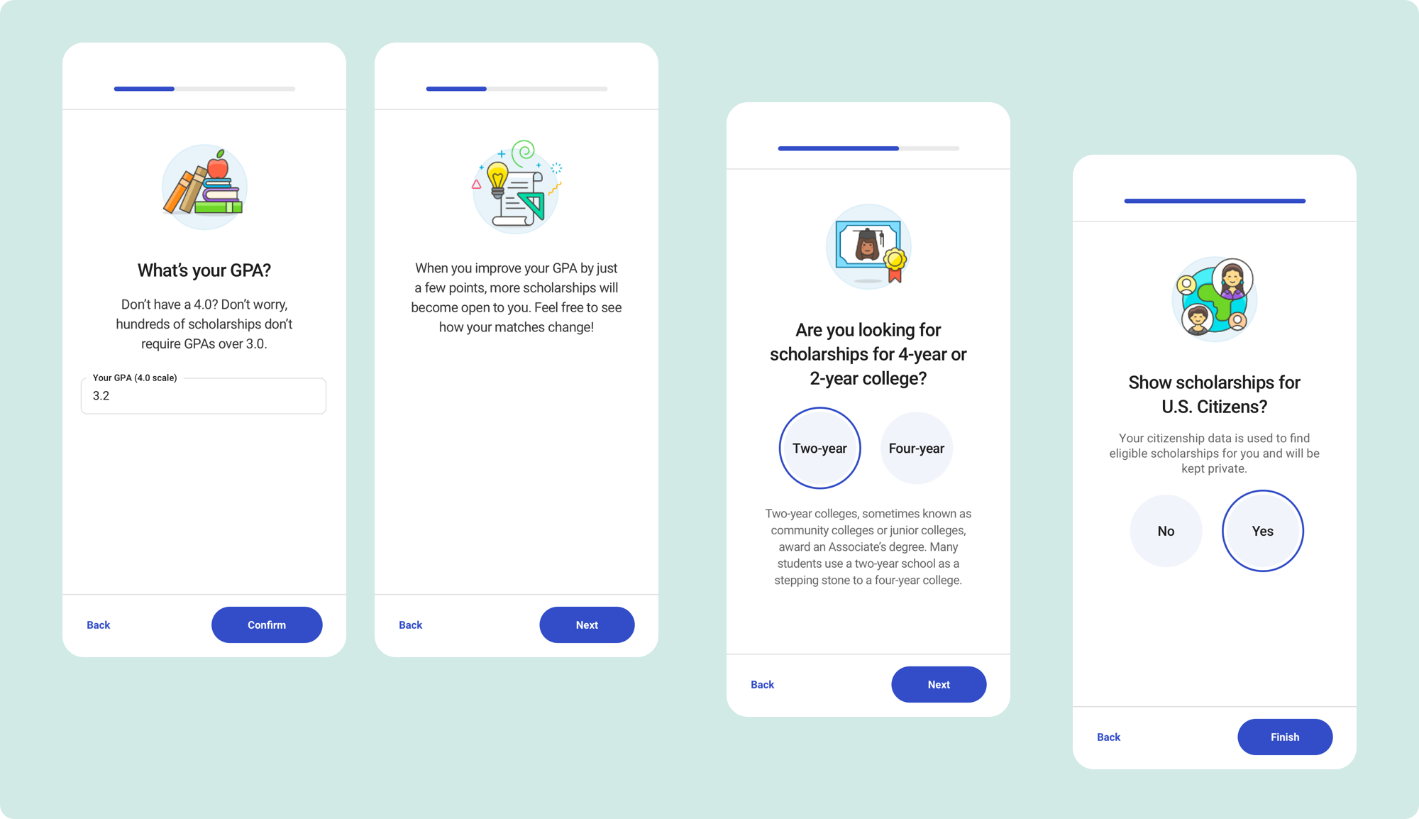
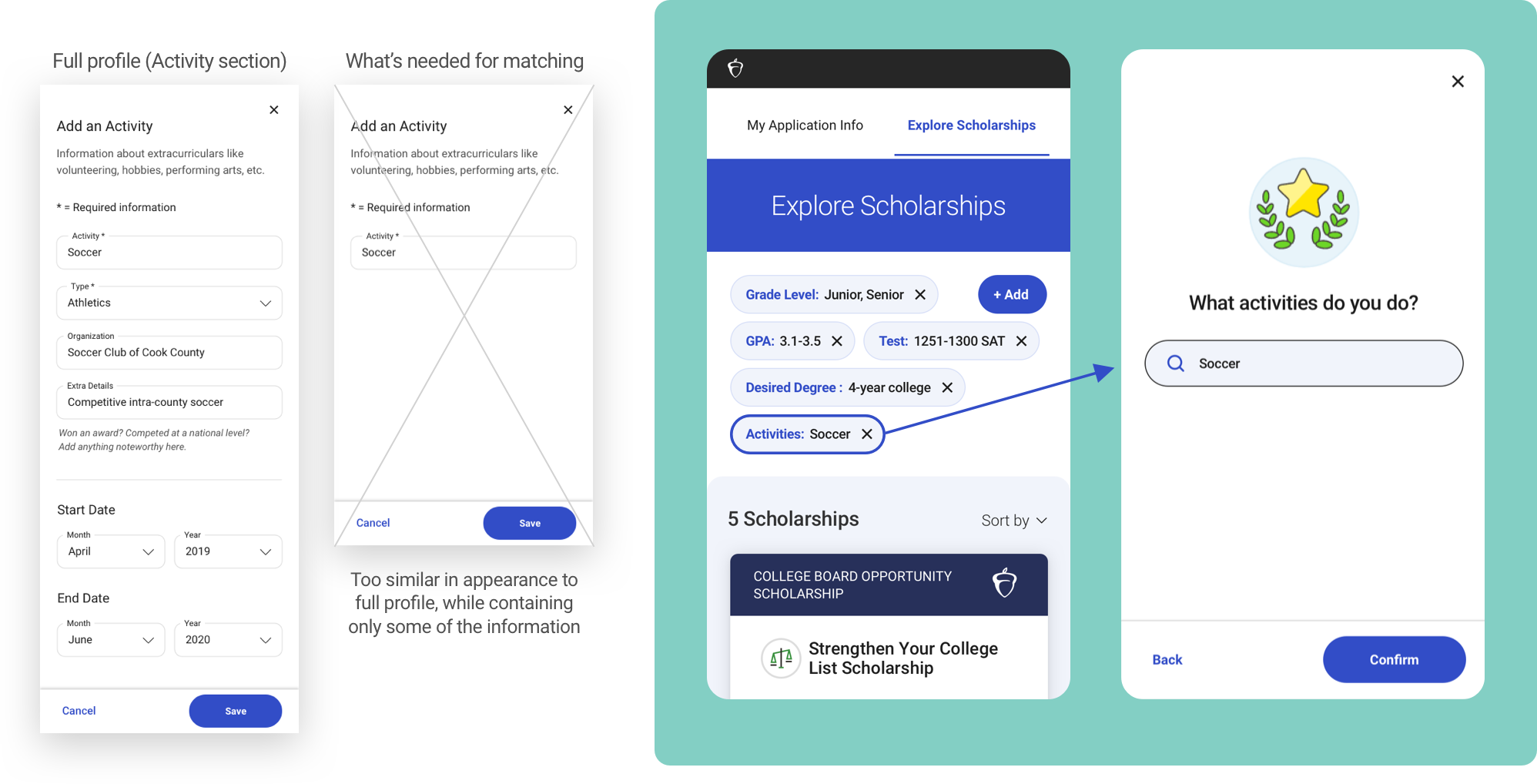
In a previous version, editing from the mini-profile took users to sections of the full application profile, which saved on development time up front, but included extraneous fields that weren’t actually used for matching. We wanted to be more targeted and only include essential matching criteria, but struggled with the overlap with the full profile experience (would it be confusing to fill out a few form fields for search, and then go to the full profile and see the same fields, plus a few more?). Retaining the format and style of the onboarding screens for search—while keeping the full application profile in its own section as straightforward forms—allowed us to differentiate the two experiences and avoid confusion.
Future explorations
There were several things we wanted to test in future iterations.
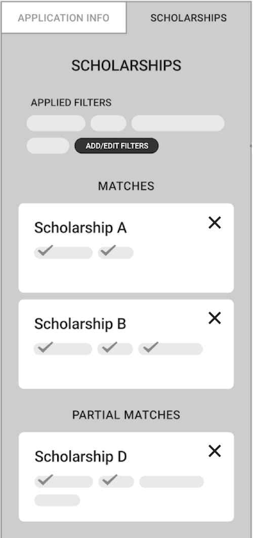
• The idea of carrying exploration through to the results, by not restricting them to strict matches but allowing ranges of matches where the most relevant appear at the top. We wanted to explore carrying the filter pills through to the results in the cards. This way, underclassmen (who don't yet have SAT scores) or students who hadn't filled out all of the fields, could still see results that are partial matches. They would know exactly how they're matching, and which requirements they're missing (e.g. a certain GPA).
• User interviews showed us that students were getting a significant amount of clearly irrelevant results (specific high schools, states, etc. that didn’t match). While we worked with content engineering to tweak the data/algorithms for better matches, simply adding a way to delete irrelevant result cards would give the student more control in that case, and also when given a wider range of results.