Rose Pak
- UI/UX
- Visual product design
- Responsive web design
Background
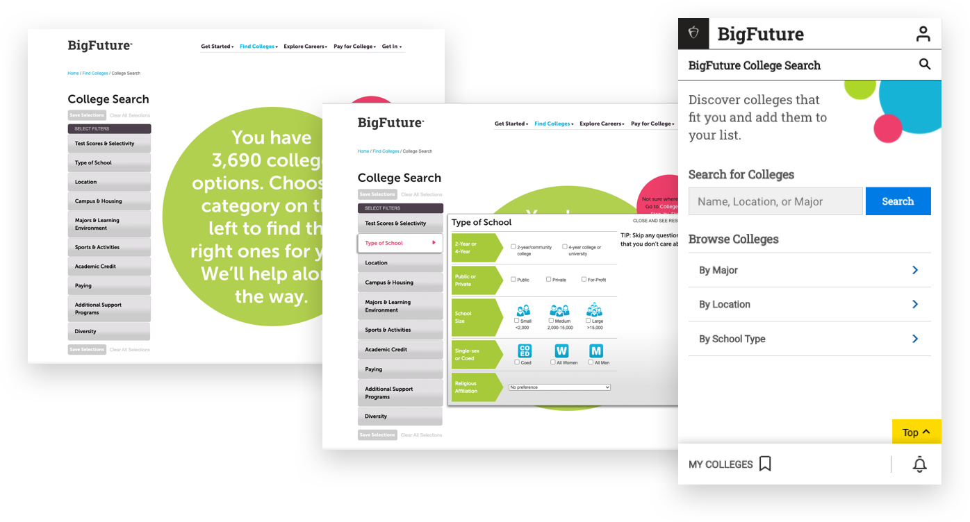
Our team’s task was to overhaul the existing college search tool to be more usable, and to encourage students to discover and apply to multiple colleges that are the right fit for them, both academically and financially. The team did an audit of all the features and filters of the existing tool. It was clunky and had different experiences for desktop and mobile. We conducted interviews to discover its pain points, ran a competitive analysis of other college search sites, and researched search pattern best practices. Using surveys we were able to identify what was top of mind for students when looking at colleges.
Design
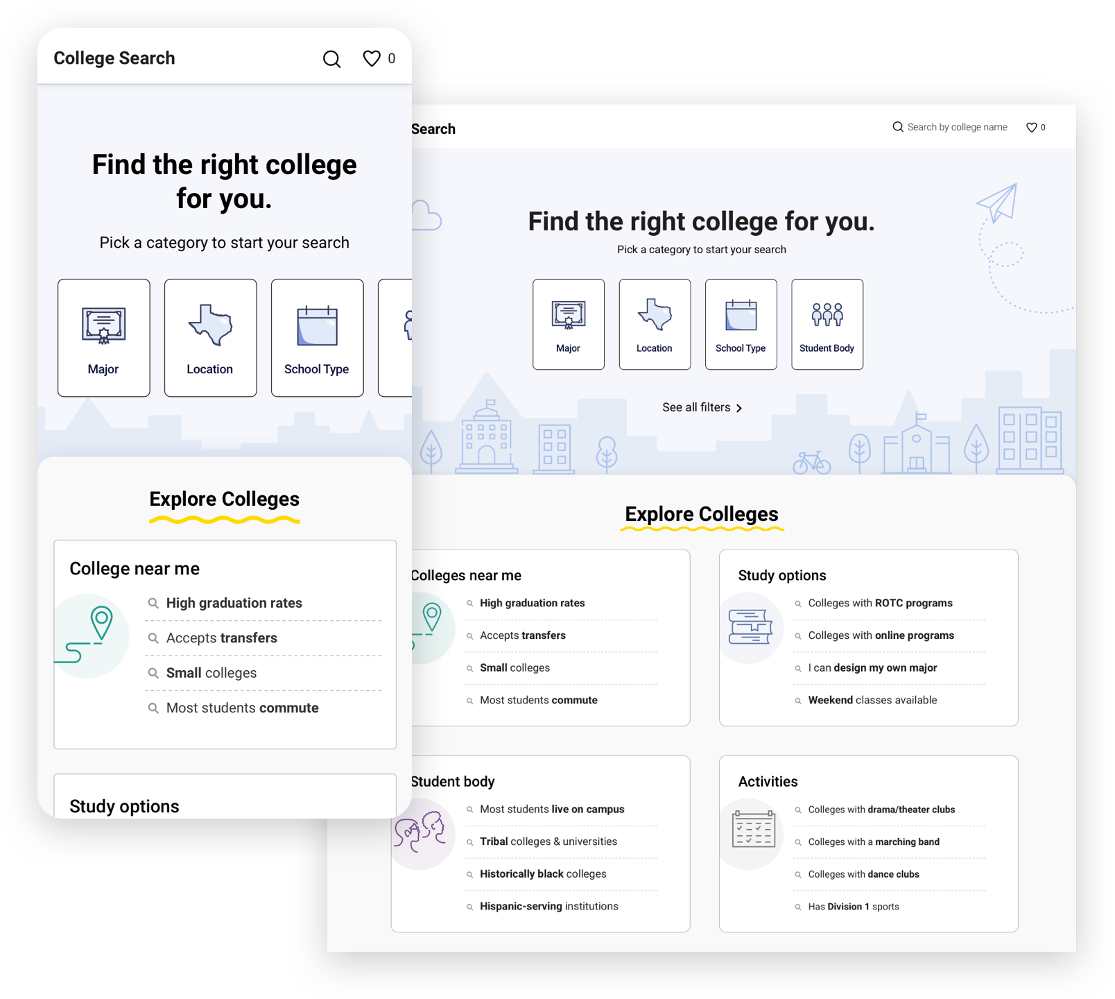
After trying out a few different layouts for the home page, we decided on a horizontal scrolling card menu featuring students’ top-mentioned attributes by order of priority (major, location, school type, and student body covered over 80% of their concerns), and we carried the horizontal movement through to the filters experience as well. In service of underserved students who might not know enough about the college search process or have proper guidance at school or at home, we wanted to provide a rotating exploratory section to spark ideas and options they might not even know about. In user interviews students expressed interest and surprise at some of the suggestions listed in this section (“I didn’t know I could design my own major”).
Filters
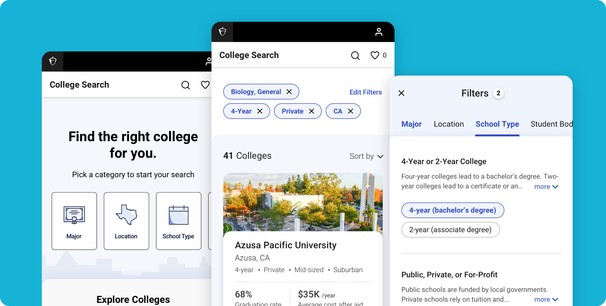
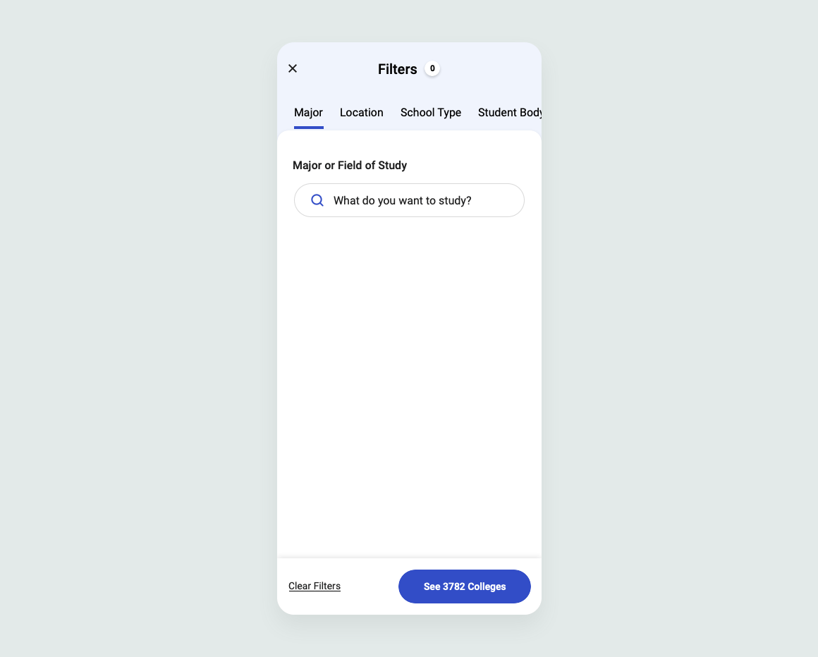
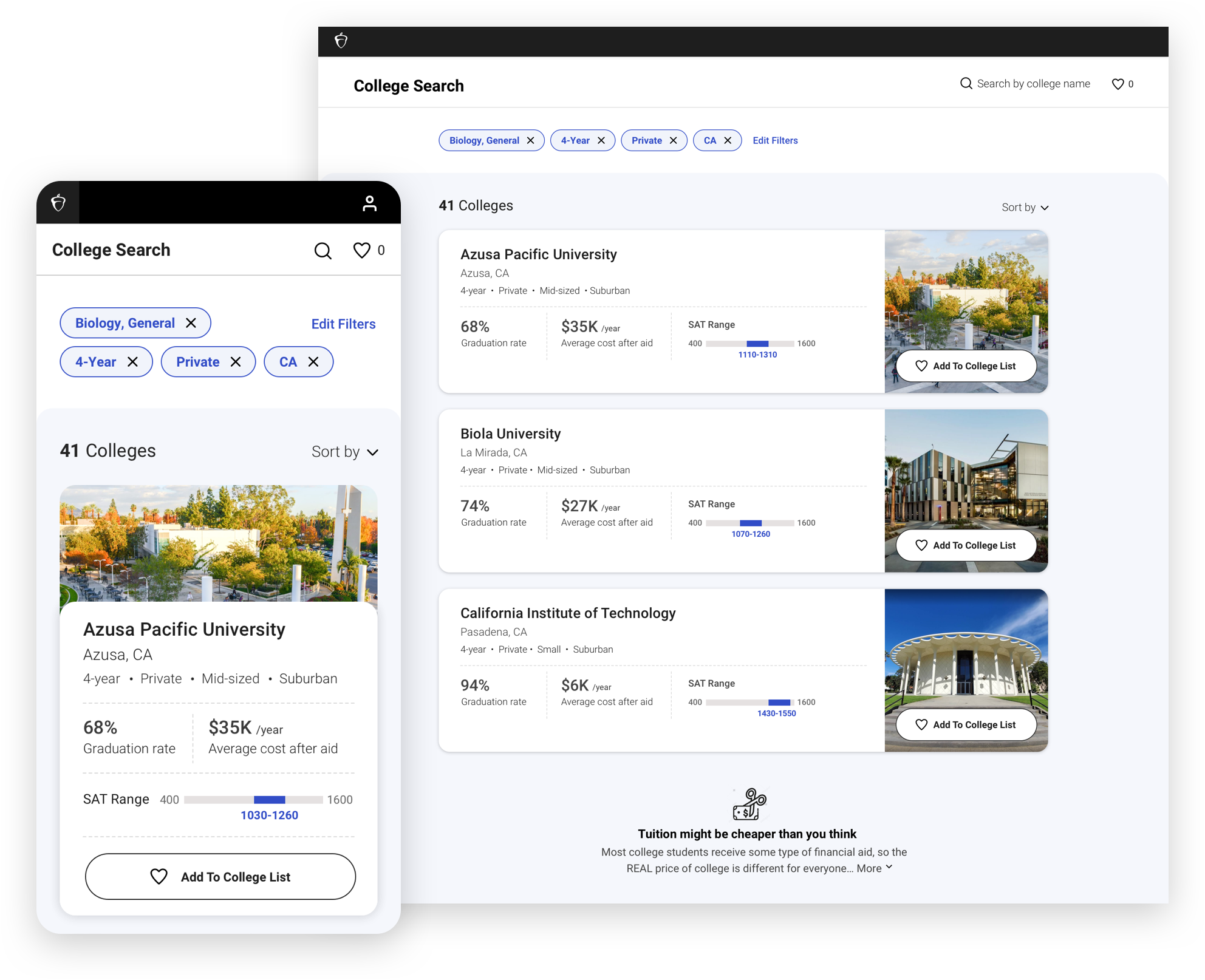
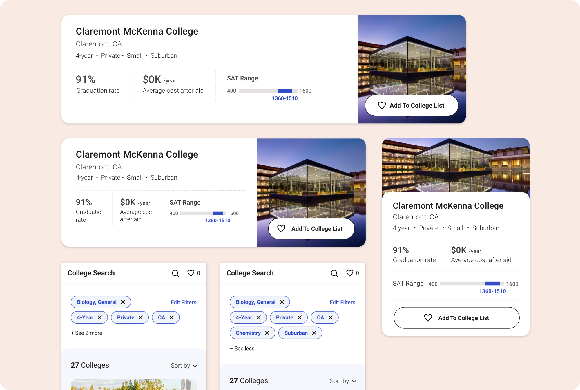
The existing tool was robust in that it had many categories of filters to choose from, but this also created a challenge in terms of organization, the possibility of overwhelm, and of filtering a student out of results. The team prioritized, cut, and reordered filters. From the home page users are brought into the filtering experience, which includes more categories than are featured on the home page. We prototyped and tested the menu and found that users were familiar and comfortable with horizontal scrolling, and were able to understand the filter selection process and how that affected their results. A bolded blue category title shows which categories have filters selected, a counter at the top accounts for how many total, and the number of colleges in the action button quickly lets the user know if their choices have given them a manageable set of results, or if they’ve filtered themselves out.
Results
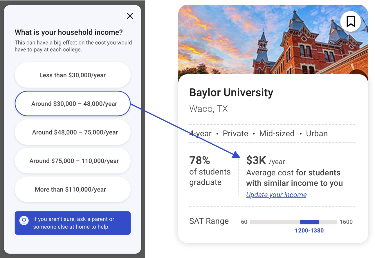
We aimed to give clear, easy-to-scan results cards highlighting information essential to the student’s decision-making process. It was important to feature the average cost after aid, since many students see the sticker price of colleges and rule them out, when in fact most families do not pay the full price, and “quality” colleges often give more financial aid and could be more accessible than lesser institutions. A common perception students had was that private colleges would be financially out of reach compared to public schools. We wanted to encourage students to apply to what were the best colleges for them: the ones the highest graduation rate at the best cost available. This would increase their likelihood of graduating, and with the least amount of debt as possible. Graduation rate is an important proxy metric for assessing the quality of a school, and a strong indicator of a student’s likely success in college and beyond. To that end, we prioritized—and allowed to sort by—graduation rate in the results, and added informative interstitial banners. The SAT Range addresses the question of “What are my chances of getting in?”, instead of presenting a possibly discouraging acceptance rate. A simple visual infographic helps the user quickly identify where they fall on the range and compare between colleges.
College List
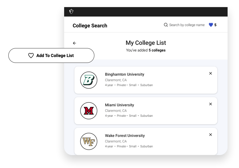
An important aspect of the results is the ability to save colleges to a student’s list. Aside from the obvious point of being able to refer to them later and to compare, we want to encourage students to apply to a well-rounded variety of schools, which increases their likelihood of getting in to a "good fit" college. In a previous version, the College Board offered scholarships to students who added 3 reach, 2 match, and 1 safety college (based on SAT scores) to their list—the idea being that with a balanced list, students would add colleges they may not have considered before. Future versions would explore how to get that messaging across, and how students could organize results according to reach, match, and safety colleges. And so, we felt it important to make the “Add to College List” buttons prominent, and spelled out in their entirety, as opposed to simple bookmarks or heart icons. Subtle animation gives a pleasant pop. Simplified college cards help differentiate this page from the search results.
Issues and explorations
I started work on this project before going on maternity leave, and it went through many changes and iterations during that time. The home page's exploratory section was cut—while a nice idea, it could in reality be limiting and unrealistic in terms of how a student would want to do a search. For the first iteration, filter categories were further cut by more than half, which meant we lost out on some of the more specialized search criteria like housing options and accessibility support. Doing this helped make the experience less overwhelming. While our filter system made sense to users, it felt unwieldy and too complicated. We also weren’t sure if we could entirely trust the outlying data and whether it would filter accurately — were colleges actually filling out these yearly surveys comprehensively? Were they listing every study option and support program they have?
Future iterations include further explorations of an optimal filtering experience, integrating the concept of Reach/Match/Safety colleges into results and the college list, and focusing more on the subject of affordability and possible customization of results based on household income.