Rose Pak
- UI/UX
- Visual product design
- Responsive web design
Background
As a new mother I obsessively tracked baby’s and my schedules—feedings (both nursing and bottle feeding, milk and formula), pumping, sleep. Days and nights were turned upside down, time was a blur and didn’t make much sense. I downloaded a simple popular tracker to record everything and referred to it constantly. Once one thing was done the next task came right up, in a relentless cycle. So the tracking app was indispensable but there were a few things that I found annoying about the interface and flow that I felt could be done better.
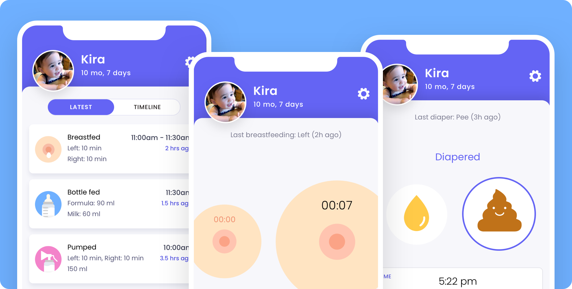
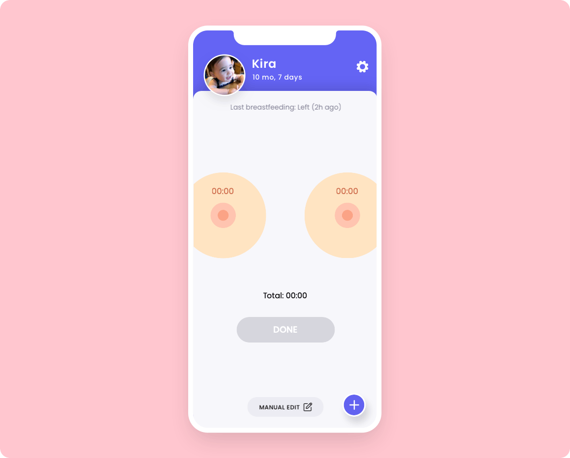
I also had kind of a cheeky idea for the nursing aspect—what if instead of using straightforward forms/ start buttons, the user tapped actual breasts to start the timer? Same for diapering—tapping some representation of poop and pee. Quite a few downloads later into competitive analysis, I came across that same concept, very much how I’d imagined it. I was disappointed but figured I’d move on ahead, not all ideas have to be original and it’s also about the system and look and feel as a whole.
Design & Animation
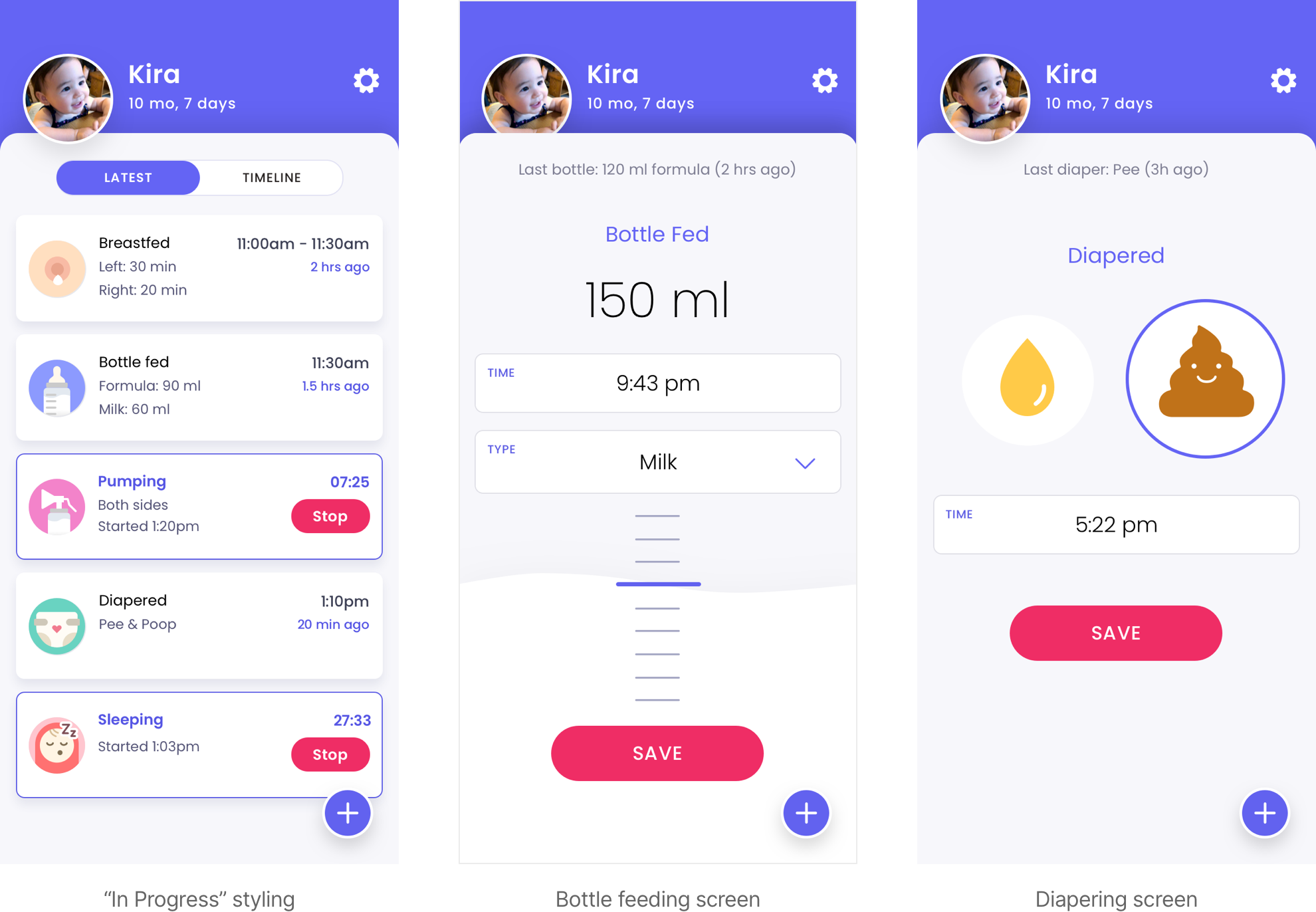
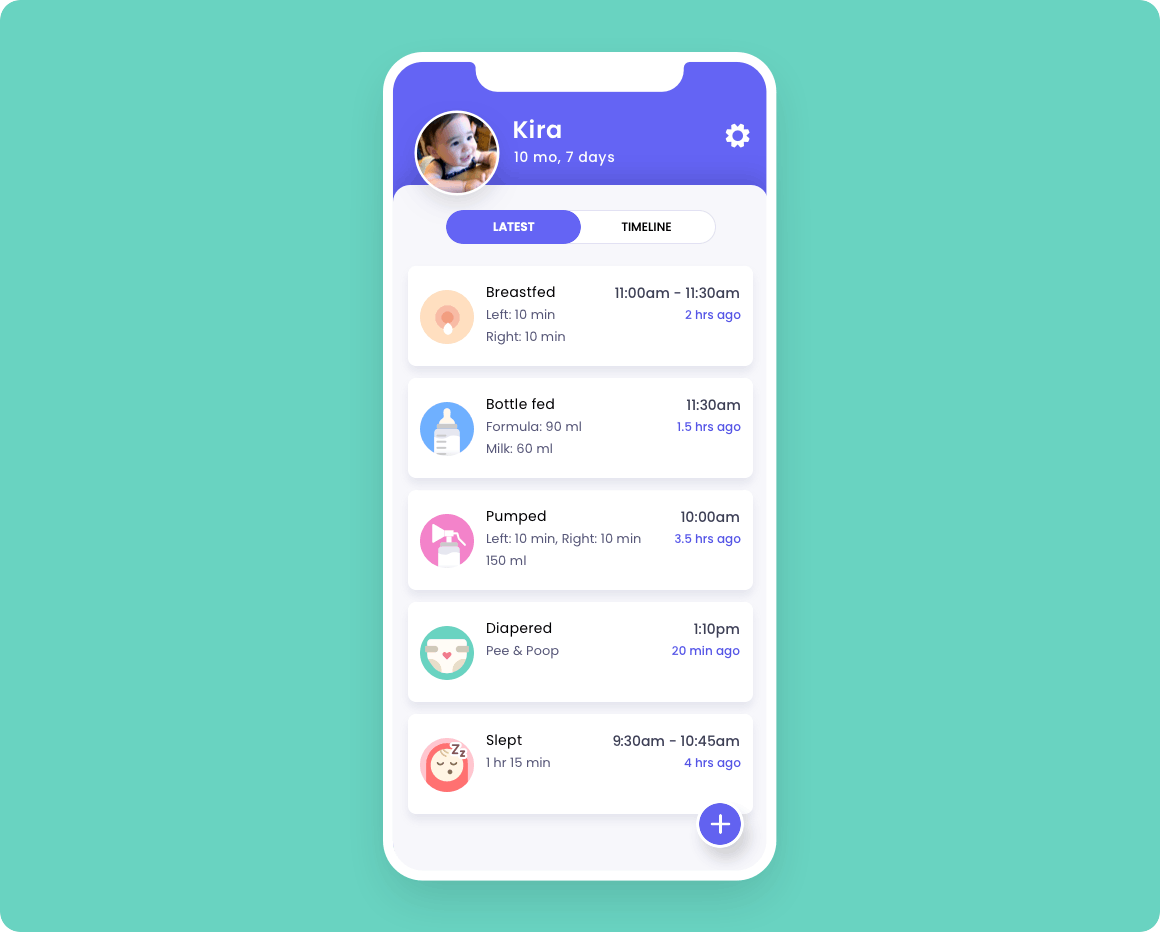
The home screen would be summaries of the latest occurrences of five categories—breastfeeding, bottle feeding, pumping, diapering, and sleeping.
I had started out with a fixed persistent bottom navigation to try to keep every category quickly accessible, but there were just one too many categories for comfort. Breastfeeding and bottle feeding could have been covered under “Feeding”, but that would require an extra step to choose once on the feeding page, there would be extra visual space/distraction in the form of a toggle (or tab, or however that choice would be handled), and which would “feeding” default to? The solution is a prominent and persistent but space-saving “Add” button on the lower right, which would open a snappy navigation drawer for a quick two-tap interaction that after a few uses wouldn’t take much thought.
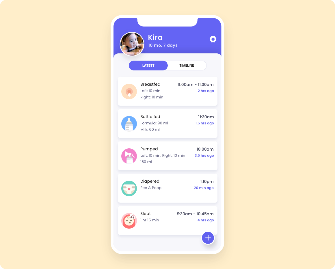
The “Timeline” tab shows the events of the day in order. It was a fun challenge to work on the animation and gain more familiarity with animating in Principle. Because time often doesn’t seem to make sense in the first few postpartum months, it felt important to include both the actual time and relative time (e.g. 10m ago) in any summaries, up to a certain point.
Timer and summary screens
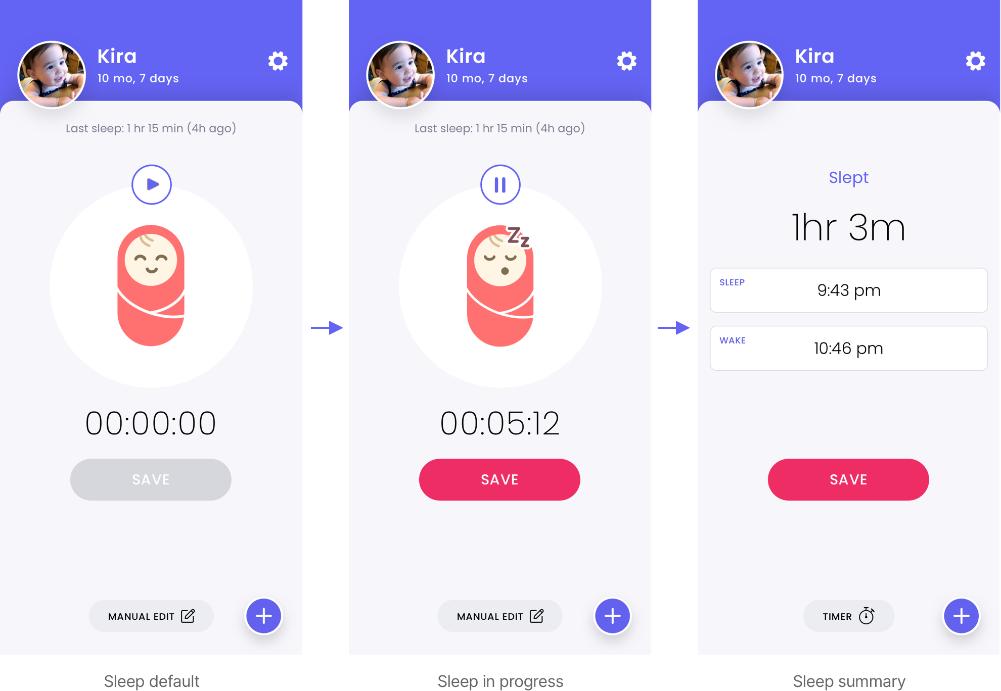
The breastfeeding timer interaction isn’t a new idea, but it was an interesting exercise in animation, and also how to make it visually simple and understandable. There are three categories (breastfeeding, pumping, sleeping) that require timers and the ability to start/pause/stop/save. Once a user stops the timer, it helps to have a summary of the session, and in the case of pumping, also necessary for entering the pumped amounts. A user may also have already completed one of these tasks without having recorded it for whatever reason (misplacing or being out of reach of the phone), making it necessary to provide a manual editing mode, for later entry. The summary and manual editing mode can be one and the same.
Additional screens
Other screens include showing in-progress states on the home summary page, a bottle feeding interaction where the user scrolls up and down to enter an amount, diapering and sleep screens. Future iterations would include a settings screen where a user would be able to enter measurement preferences (ounces vs ml), skin tone (felt very aware that not only one skin tone should be represented!), perhaps a bit of onboarding or explanation of how to use the breastfeeding/pumping timers, statistics to show trends in activities throughout the day, and alarms for next pumping, feeding, etc.