Rose Pak
- UI/UX
- Visual product design
- Responsive web design
Background
Ladders is a job search site that built its reputation on giving job seekers targeted, high-quality, six-figure jobs. It's a two-sided business with separate sites for job-seekers and recruiters, and upended the traditional model by having job seekers pay a subscription to see and apply to jobs on the site. I worked on the job-seeker side and was paired with a UX designer, and also worked closely with product managers, developers, copywriters, customer service, and the CEO.
There were a number of problems to solve and improvements to be made during my time there. Some questions were: How could we improve upon the home page to increase sign-ups, make a better search experience to increase engagement and to better match candidates with appropriate roles, and elucidate the messaging around our particular way of getting users targeted results (which could sometimes be confusing to users, and impact their searches)? How could we better organize a job listing page to show the right amount of information, that's clear and easy to take in? How do we create a mobile experience to accommodate our growing mobile traffic, that's more than just responsive, but feels like an app?
Extensive user testing and interviewing was conducted to understand users’ general and Ladders-specific job search habits and pain points. We did competitive research on other job sites and sites with complex search functionality.
Design
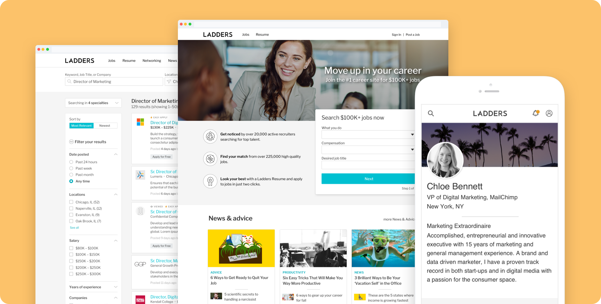
We wanted to move away from the vanilla, low-contrast Ladders coloring and give the site a more modern, fresh, personal feel. I iterated on several color directions and found a free legible typeface with many weights. I set up a style guide for quick and easy development, and worked closely with engineering to implement pixel-perfect designs.
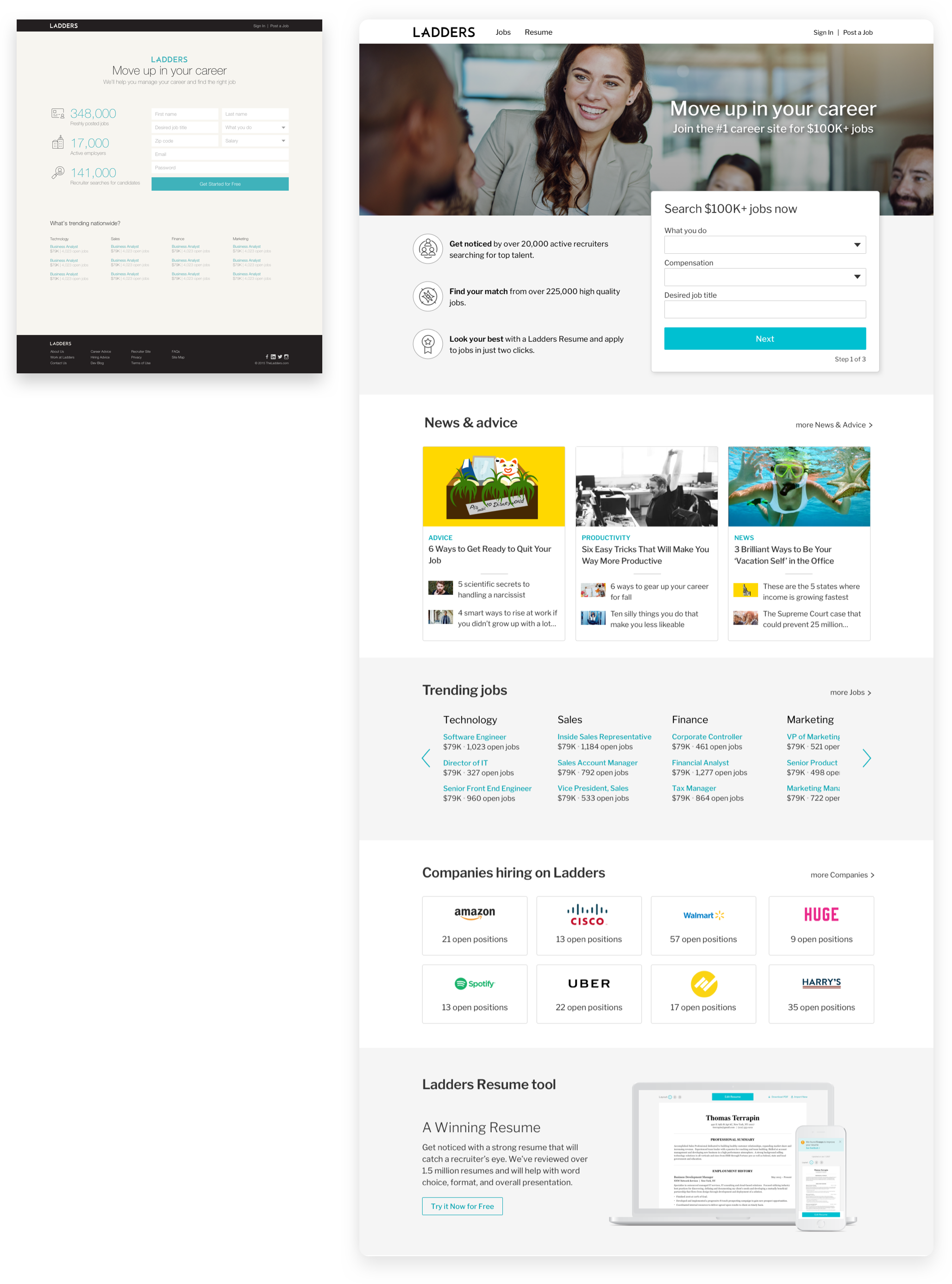
Home Page
We changed what used to feel like a roadblock into a home page that feels friendly, helpful and informative. A large wall of form fields was broken down into more digestible steps, which also helped increase sign-ups.
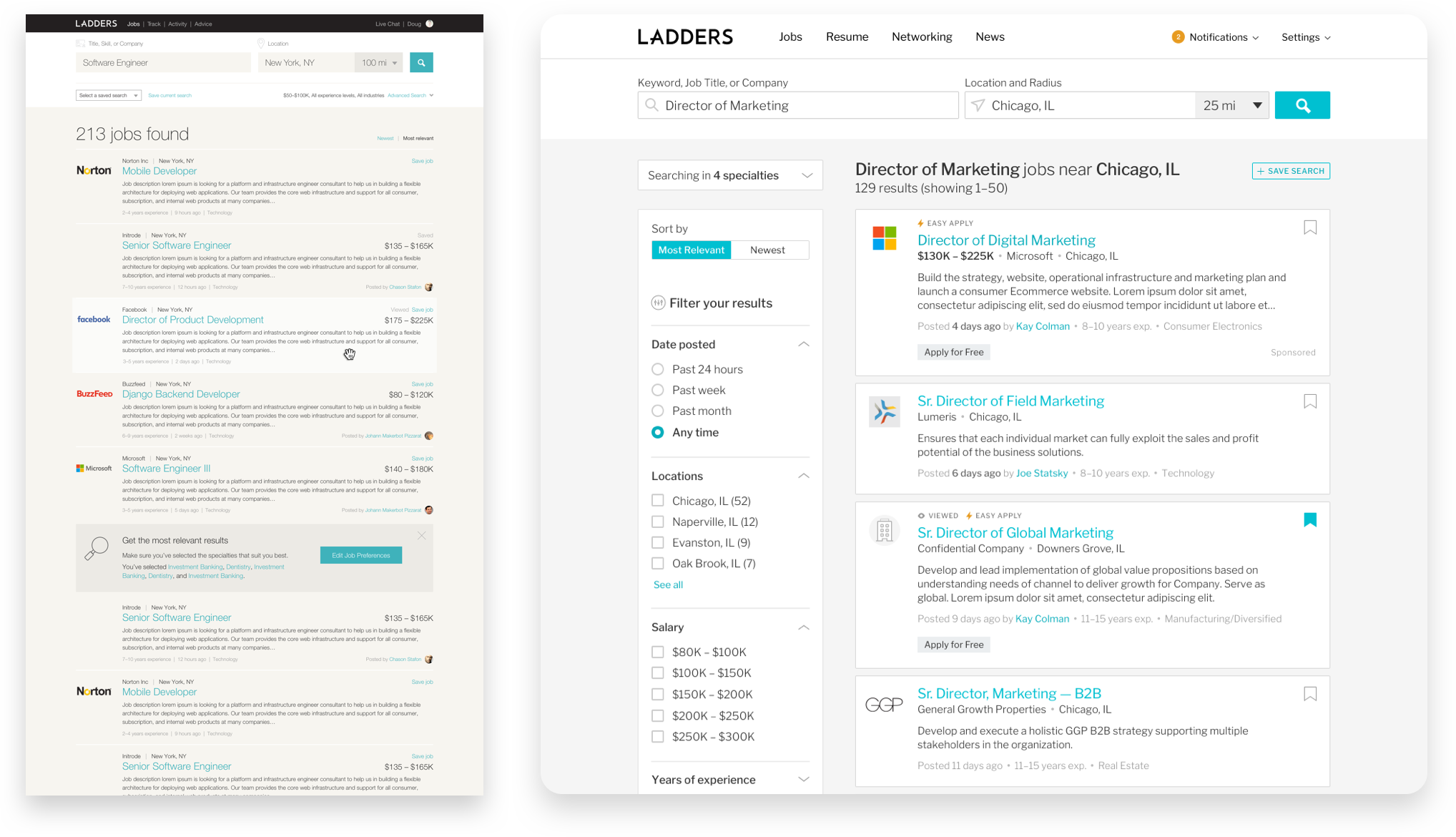
Search
We made search more modular and easy to scan, and surfaced filtering and sorting options rather than hide them under an expanding drawer. The need for this sort of filtering was mentioned by users in a number of testing sessions of the previous version of the site.
Paywall experiments
From the search results, users used to click on a job and immediately hit the paywall. Users found that off-putting, being asked to pay right after they had just gone through a wall of signup fields, and without being able to see what exactly a job listing offered. We added several public jobs with an “Apply for Free” tag, which allowed users to get an idea of the value they would get by signing up, increasing upgrade rates. These public jobs also increased signups because that was part of the application process.
Trouble with specialties
The way Ladders delivered very targeted results to users was by only showing them jobs within their specialties. Essentially, specialties was an invisible factor in their search. This led to confusion if users weren’t properly categorized — a search would yield zero results and the user wouldn’t know why. The language and banners directing them to edit their job preferences were regularly overlooked or ignored. Understandably, the connection was missed—people just expected search to work.
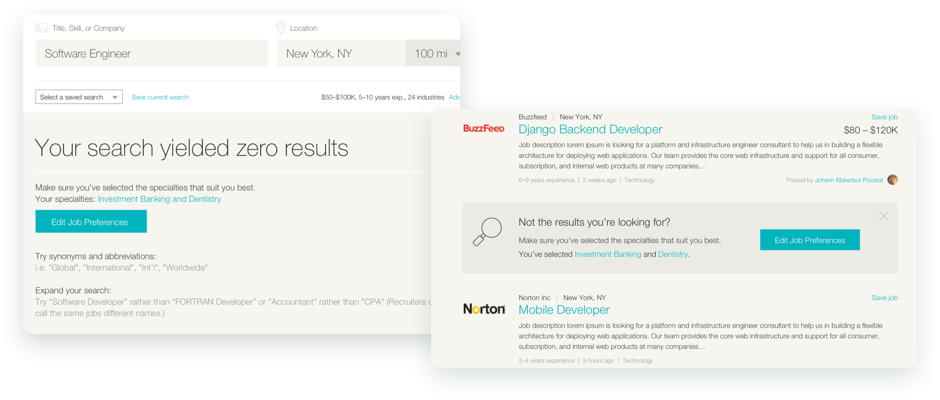
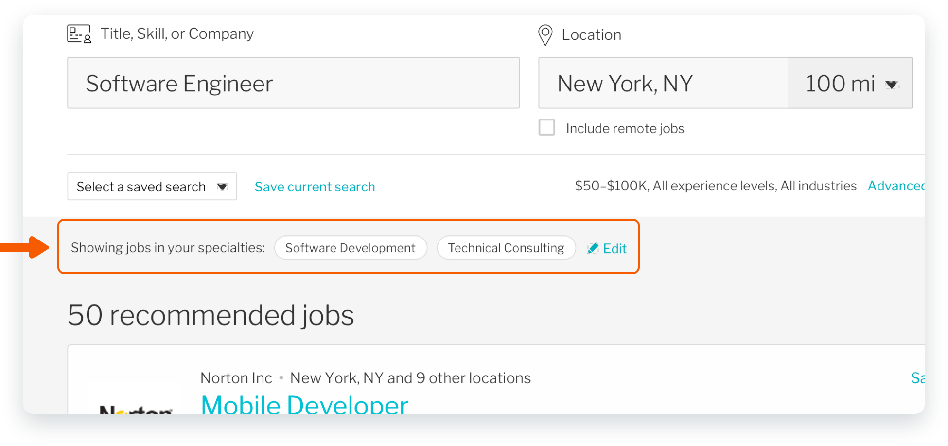
Surfacing specialties helped with the immediate problem
In the immediate term, we added a strip of specialty pills near search to clearly show that something else was affecting their searches, and plainly used the term “specialties” instead of telling them to change their job preferences (which included other factors besides specialties). After these improvements, Ladders's customer service saw a steep drop in calls/complaints about inadequate search results.
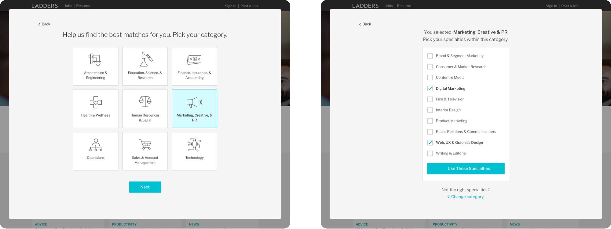
An onboarding solution
For the longer term, we added the specialty selection to the onboarding experience, ensuring users would know exactly what their choices were and making them aware of the terminology.
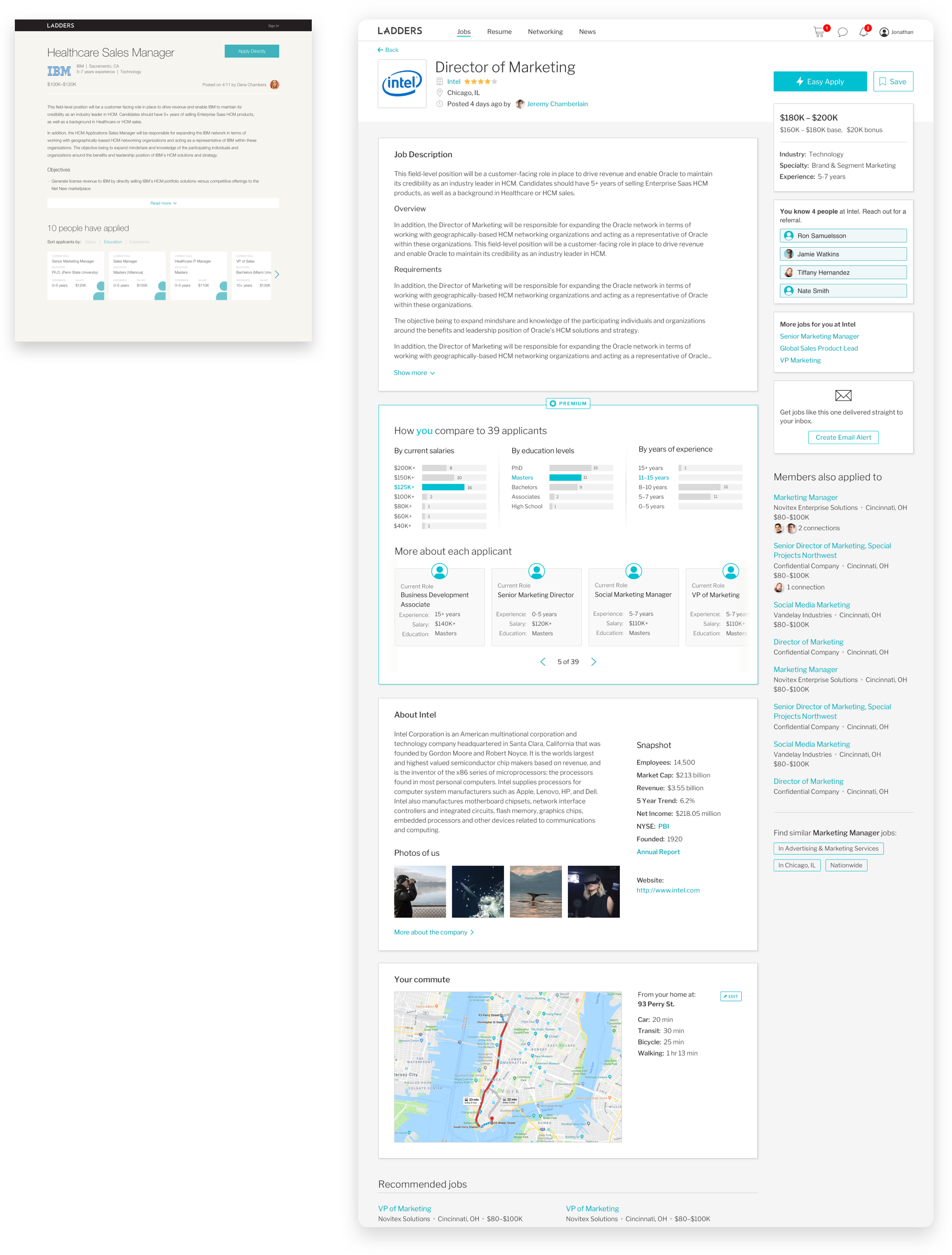
Job Listing
We created a more robust job listing page that better highlighted key information, improved upon features such as the premium candidate comparison module and introduced company-specific referrals, commute calculation, and similar jobs.
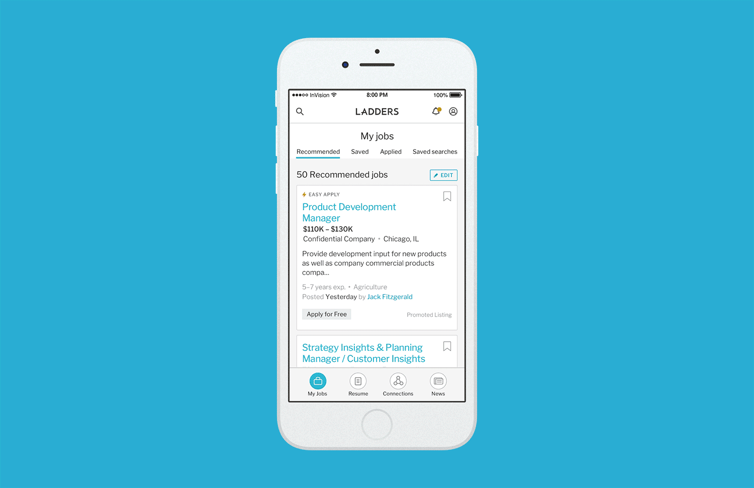
App-like Mobile Site
Working closely with developers, we were able to create a mobile experience that was not just a responsive view of the website, but a web-based mobile site that feels more like an app. Our mobile traffic was growing month by month, and we wanted to invest in a good mobile experience to stay competitive with other job apps. The card-based redesign alleviated the density of information, and the persistent navigation and notifications helped with discoverability. We iterated and ran several rounds of user testing to ensure ease of use.
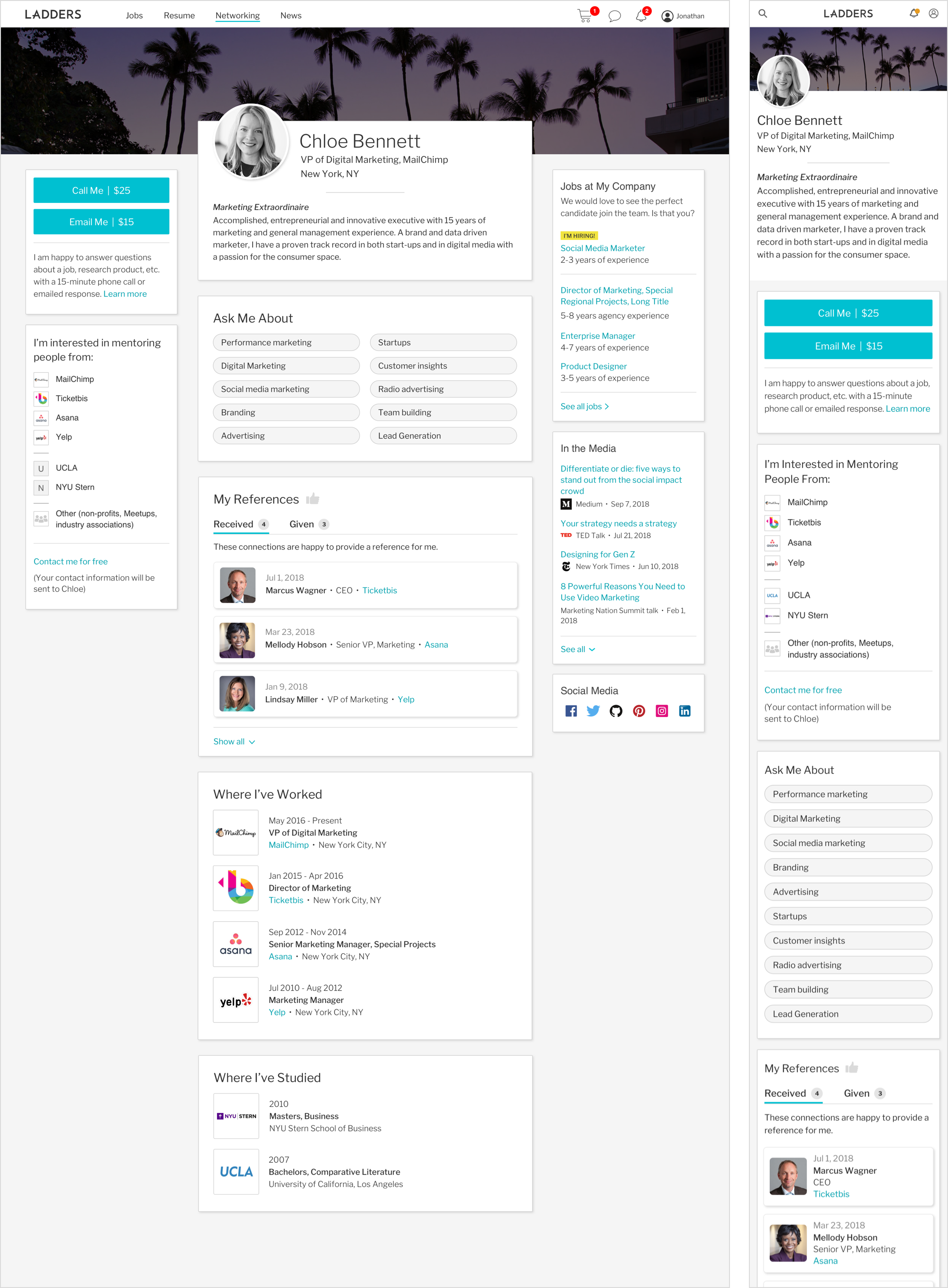
Public Profile
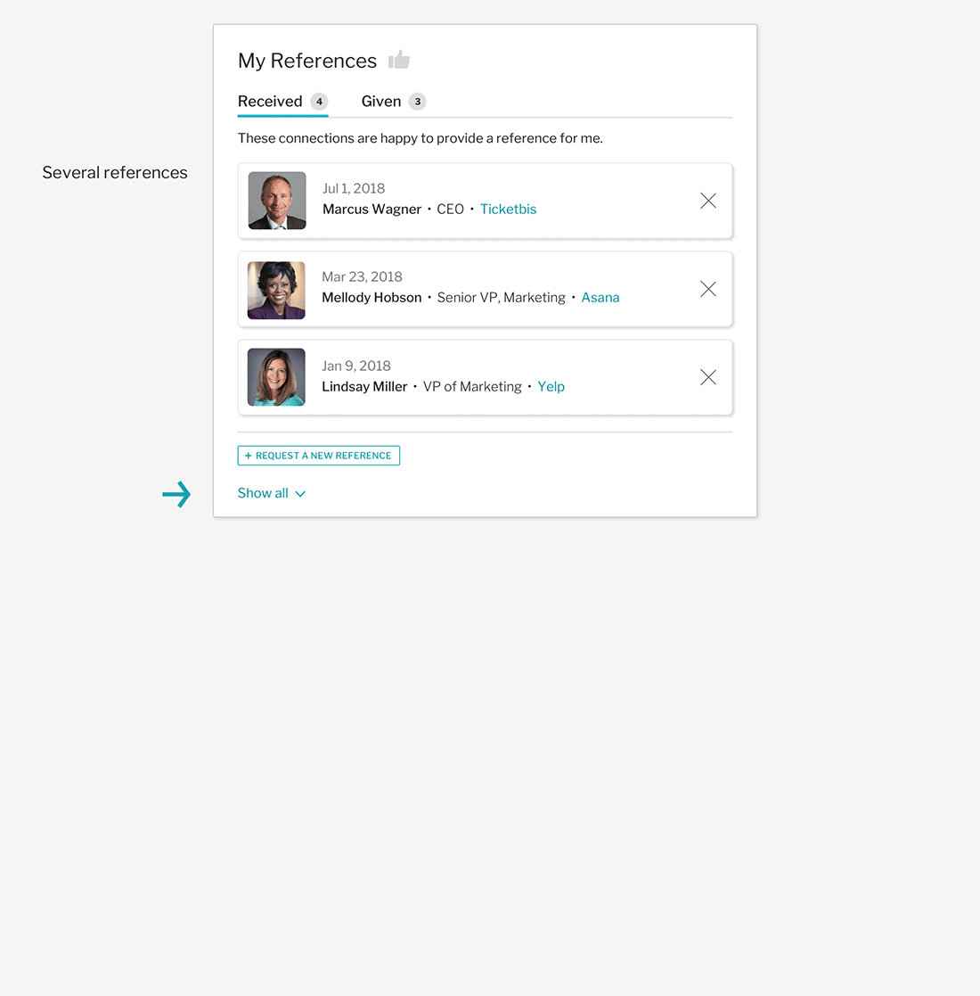
I was the sole designer on this public-facing profile page meant for users to promote themselves—their work history, education, skills, references, etc. They could also indicate whether they would be willing to mentor people in their network.
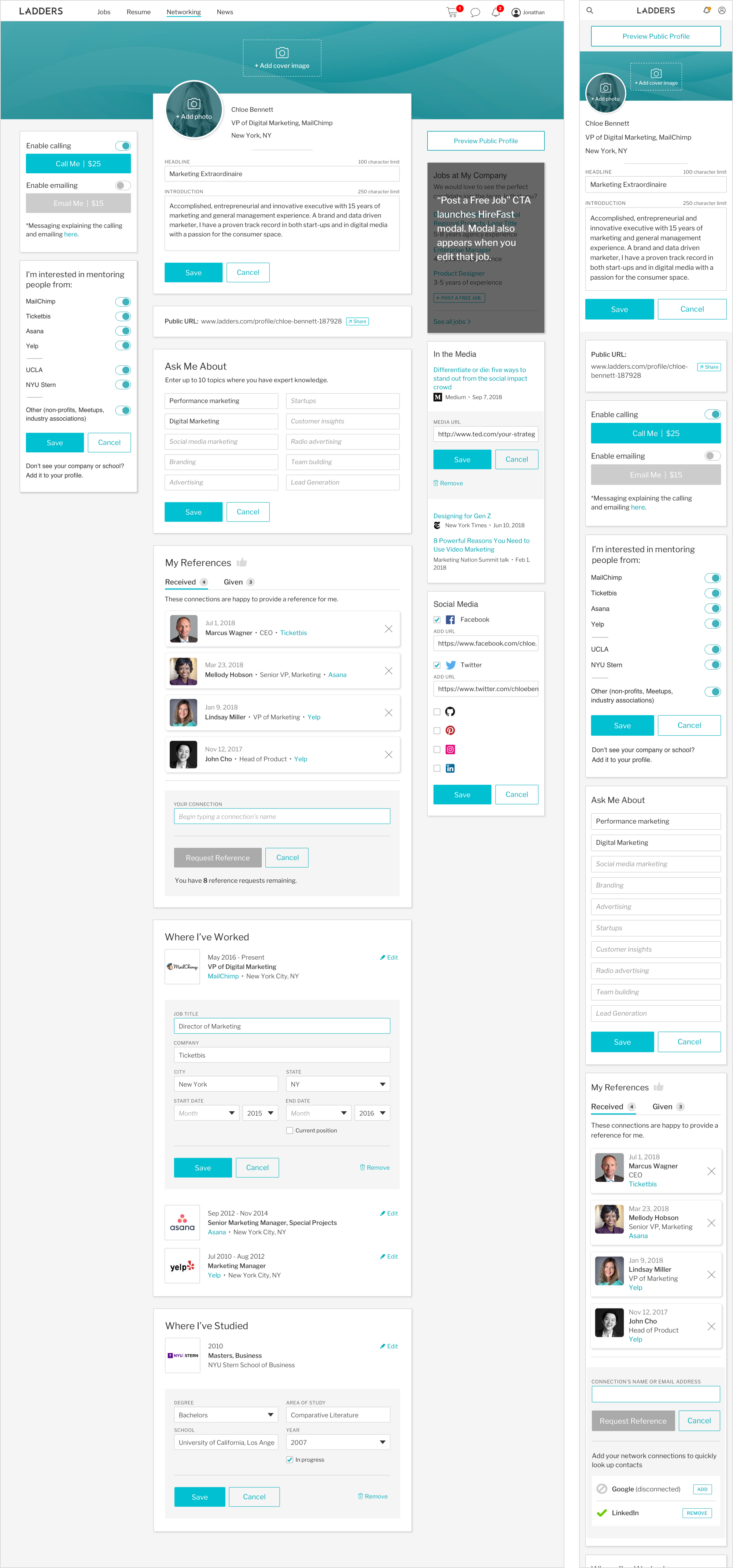
Public Profile Module: References
The user flow for each module on the public profile varied from simple to very complex. The process of asking for a reference involved uploading LinkedIn contacts, typing in a name or email address, and sending the request, triggering emails and onsite notifications. Other considerations were how many references a user could have based on subscription level and how to address that. Here is an annotated linear flow for just this section of the public profile.